| Dow | U.S. household net worth | U.S. individual net worth | Hourly earnings | Minimum wage | U.S. housing | Corn | Wheat | Gold | ||||
| Silver | CRB commodity index | Copper | Oil | Retail sales | Non durable goods | US gov't receipts | US gov't spending | PCE | CRB livestock | CRB foodstuff | Sugar | Dow, total return |
| Employment cost index | Federal, state & local debt | Median family income | Cotton | Cocoa |
Dow stock index
Same, but going back to 1900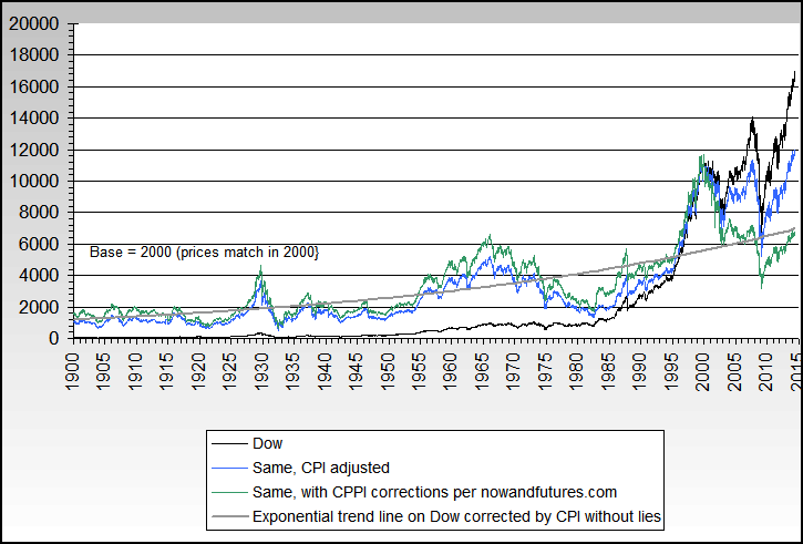
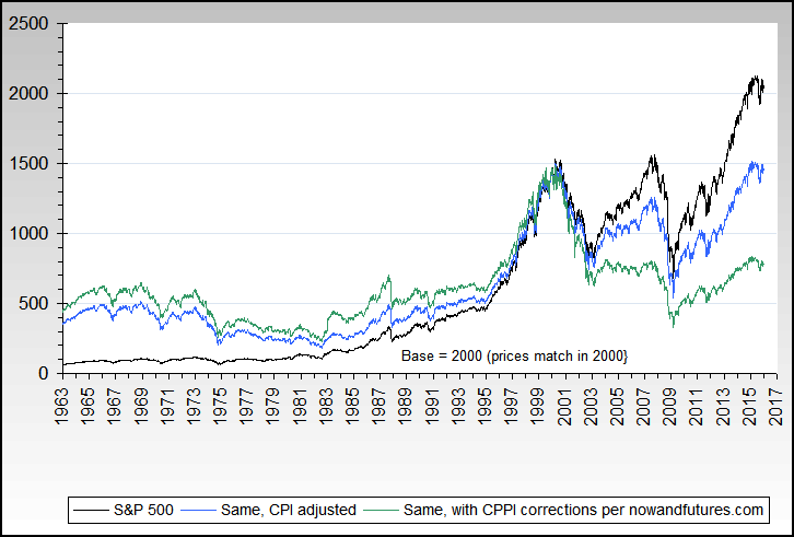
Dow stock index, total return including dividendsThe average compounded total return per year 1900 through 2009 is about 6.1%. When corrected by CPI, it's about 2.9%... and with full with CPPI corrections included, its about 2.0%. In other words, over 66% or 2/3 of the total return is inflation only... and that's before fees, commissions and taxes. 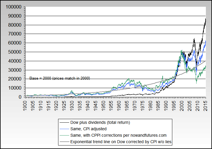
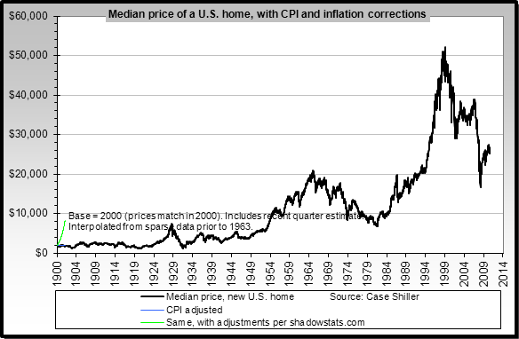
U.S. median new home prices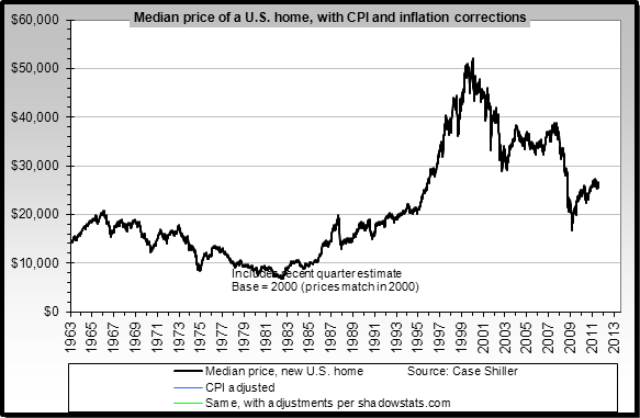
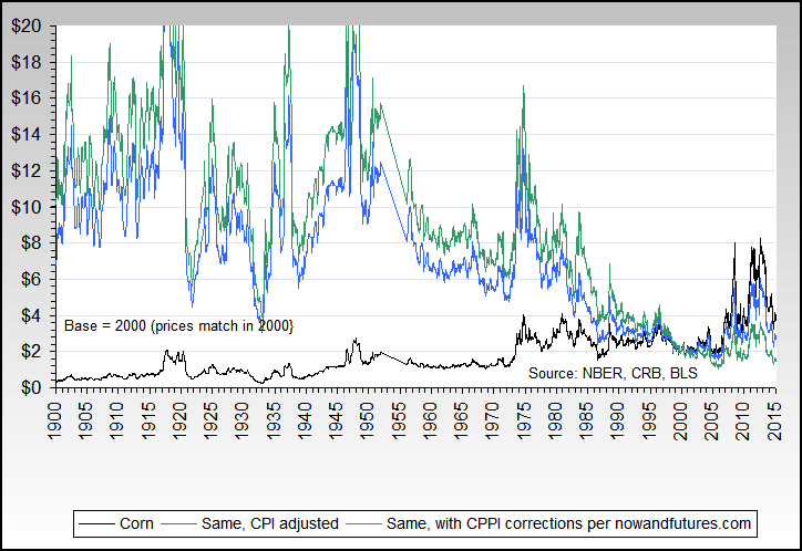
Corn
Wheat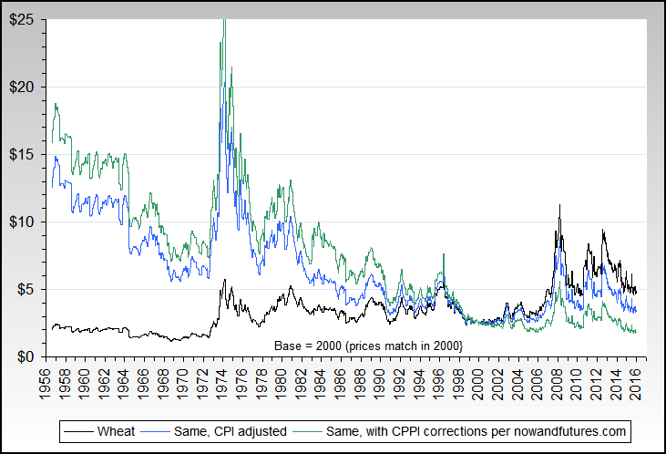
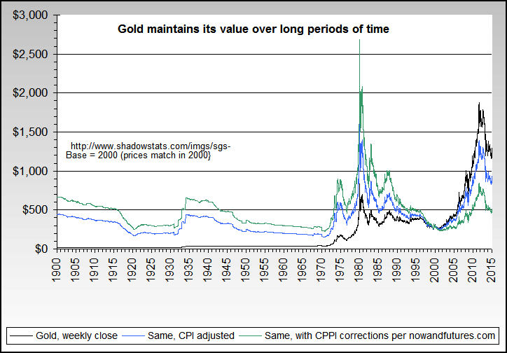
Gold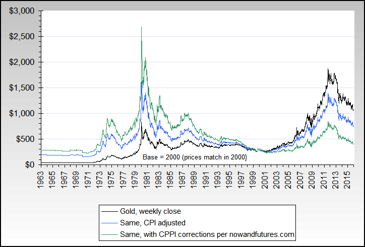

Silver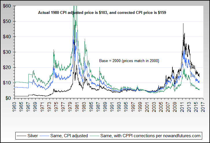
Copper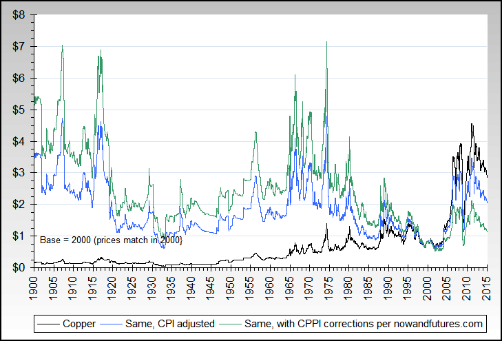
US Federal government spending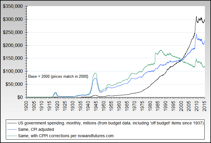
US Federal government receipts (taxes)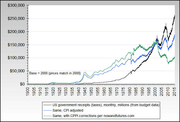
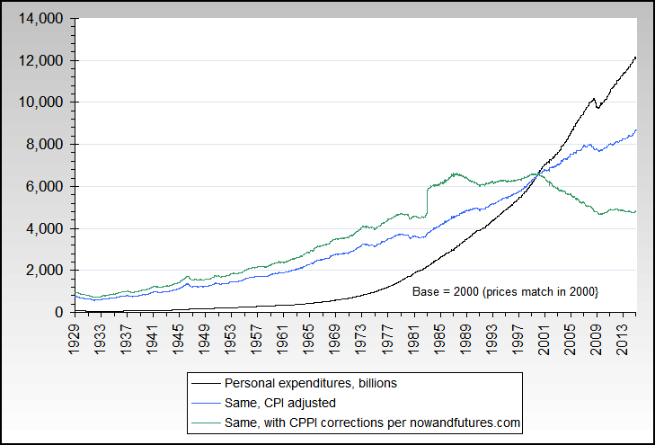
Personal consumption & expenditures (PCE)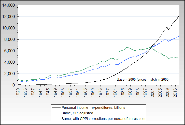
Total U.S. Household net worth
U.S. individual net worth
CRB commodity index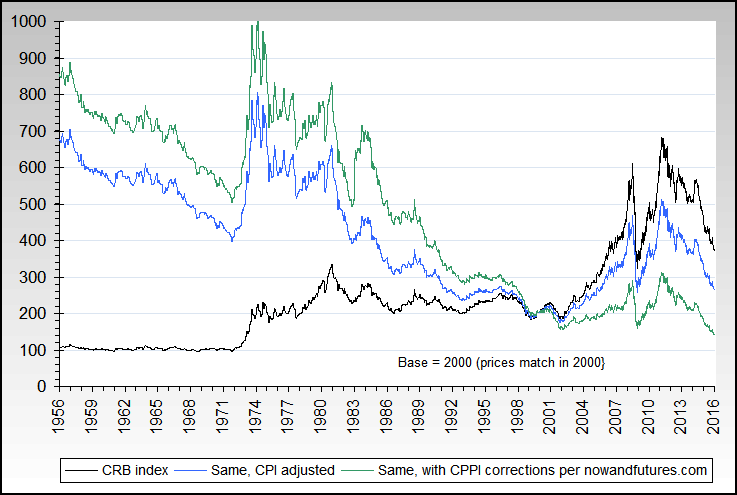
Oil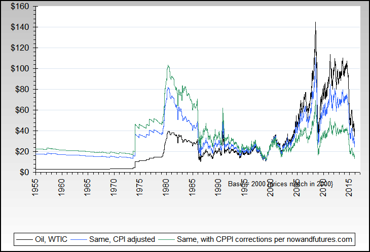
U.S. retail sales
U.S. non durable goods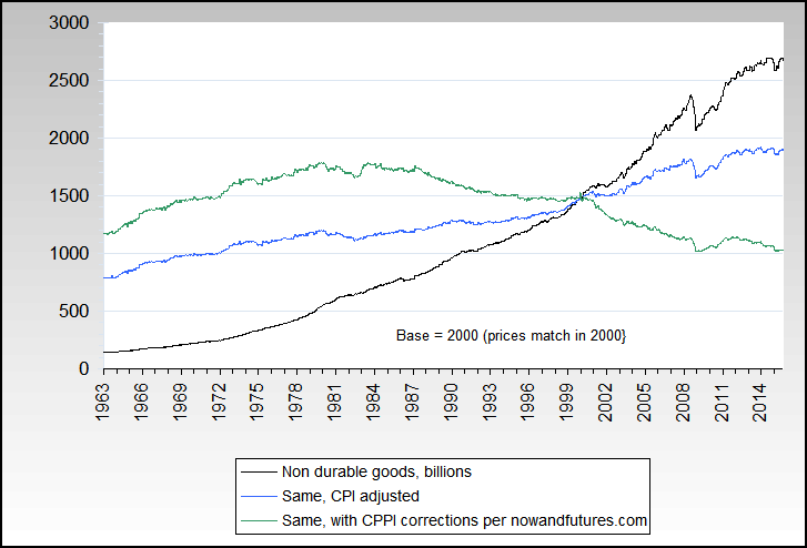
CRB Livestock Index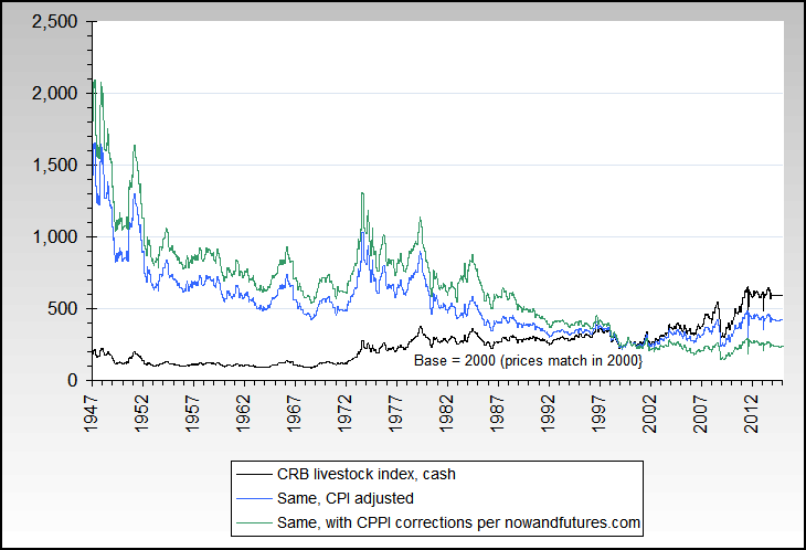
CRB Foodstuff Index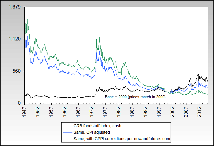
Sugar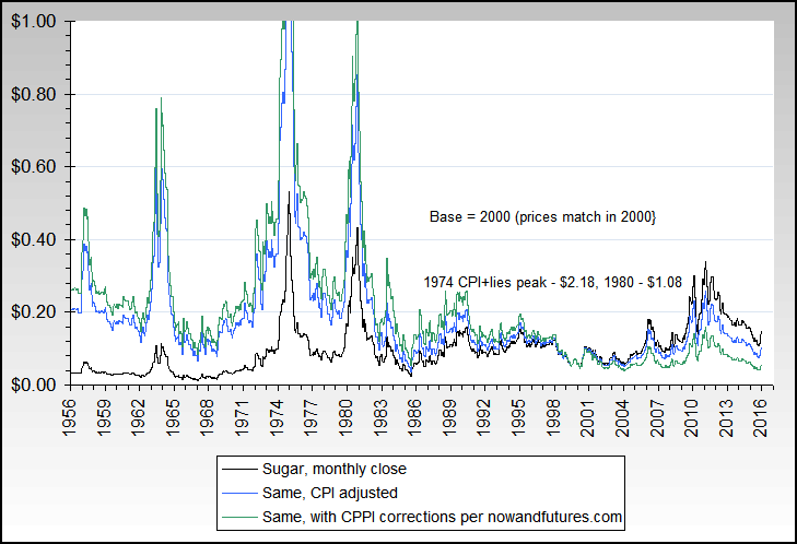
Cattle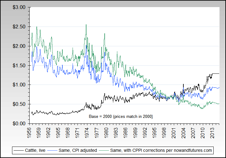
Employment cost index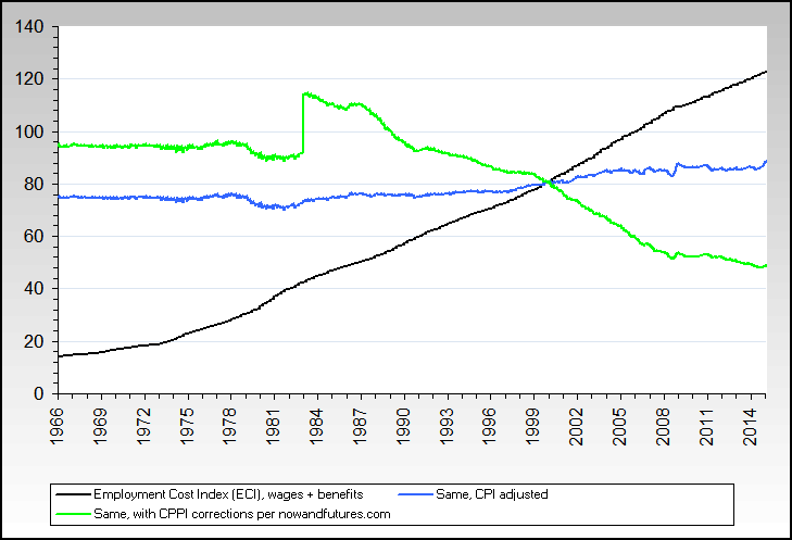
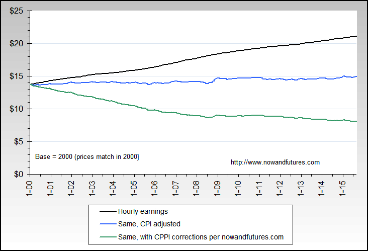
Hourly earnings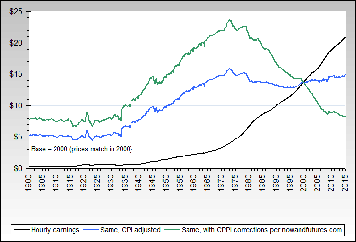
Minimum wage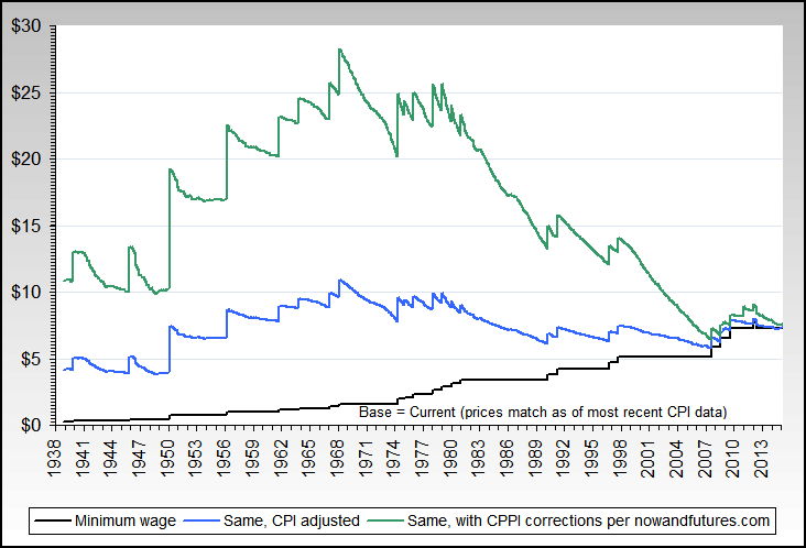
Cotton
Federal, state & local debt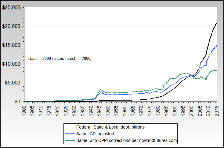
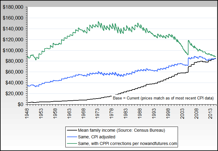
Median & mean family income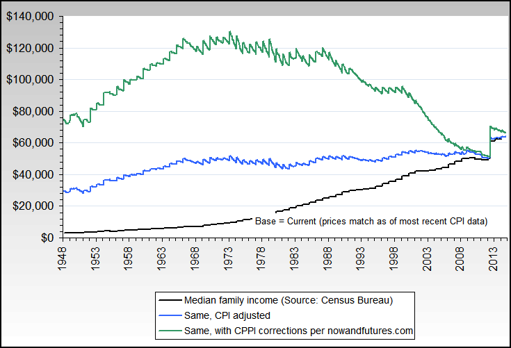
Cocoa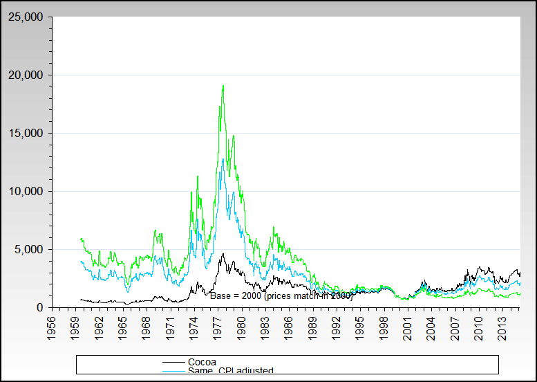
Coffee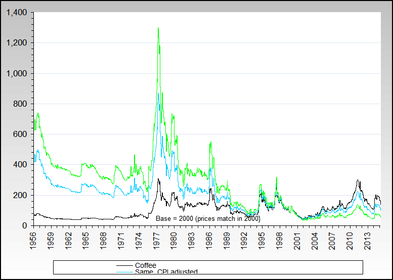
|