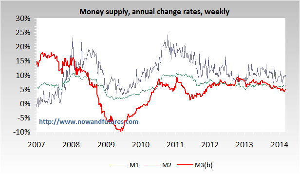
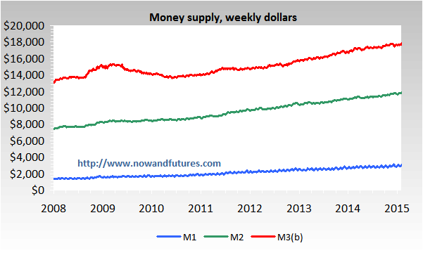
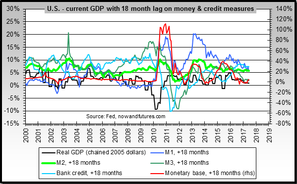
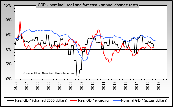
| Money supply M1, M2, M3 | TMS, Debt & Credit |
|---|---|
|
|
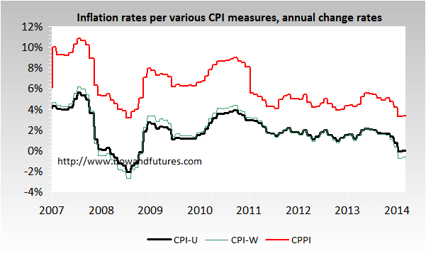
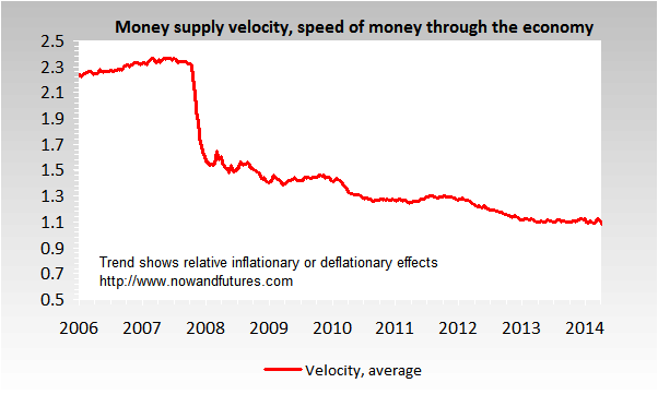
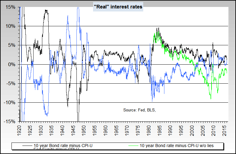
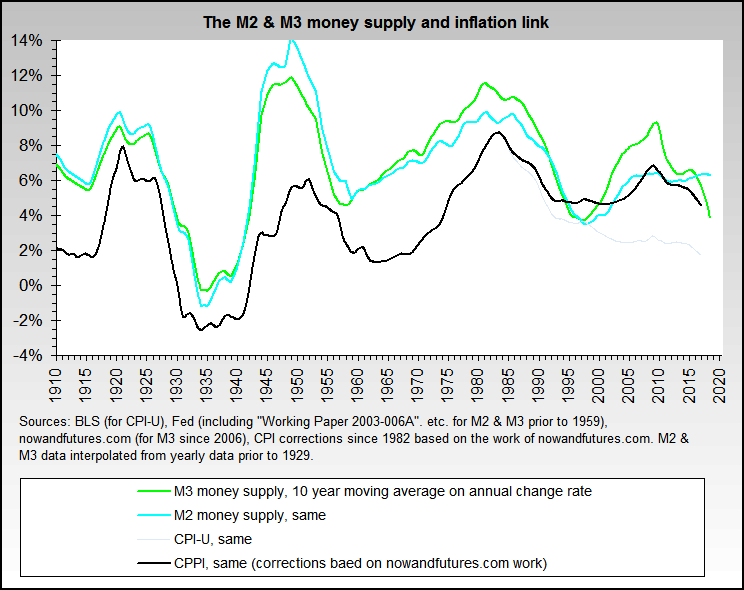
| Inflation | Velocity |
|---|---|
 |
 |
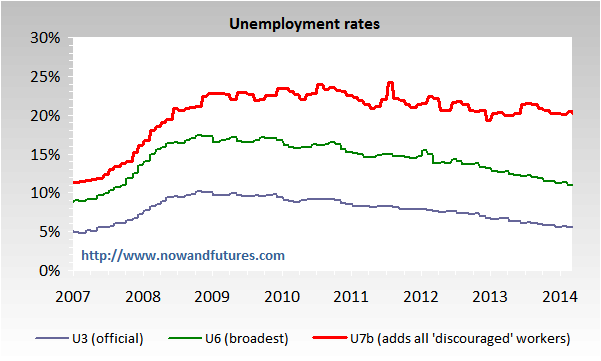
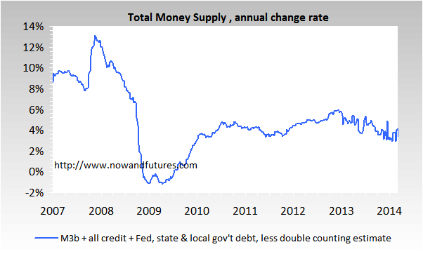
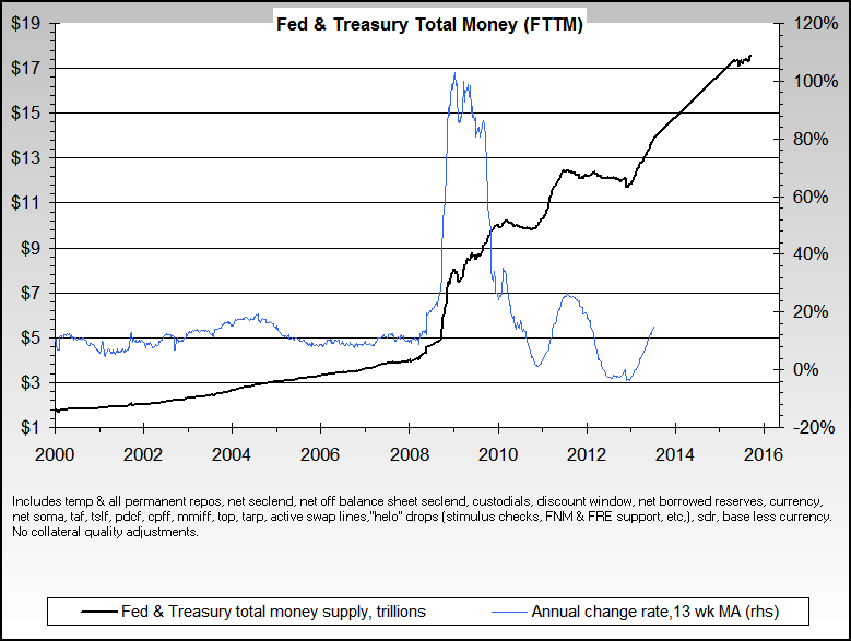
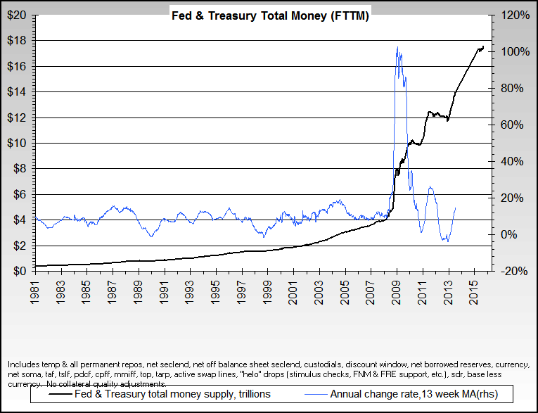
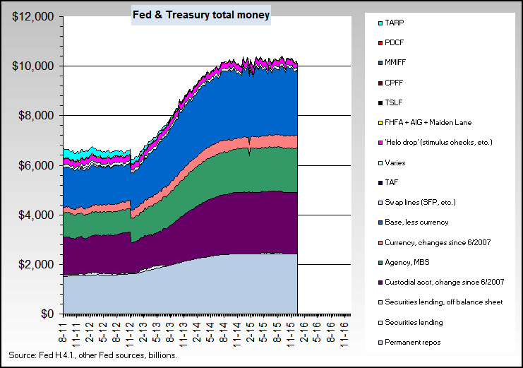
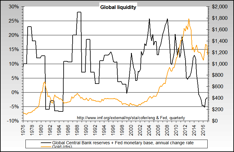
| Unemployment | Total Money Supply |
|---|---|
 |
 |
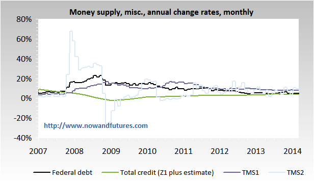
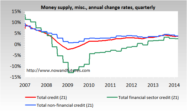
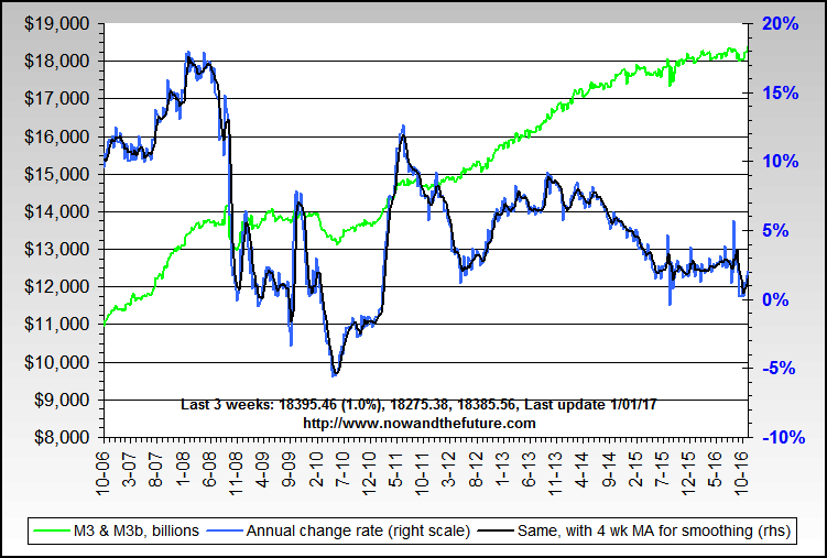
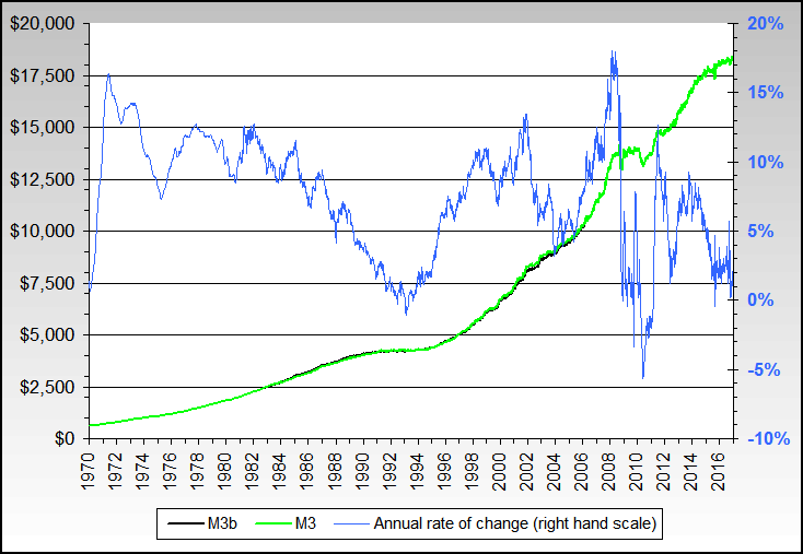
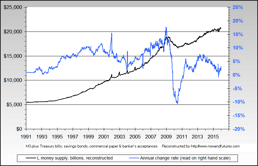
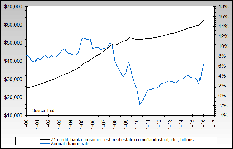
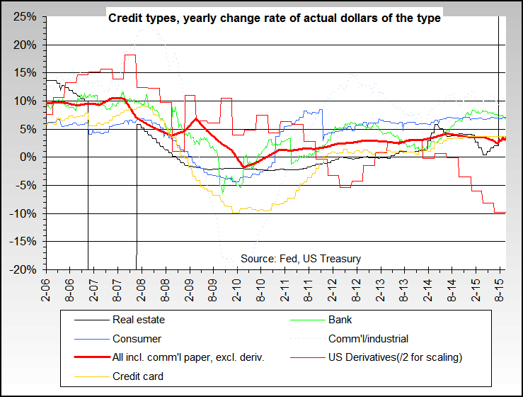
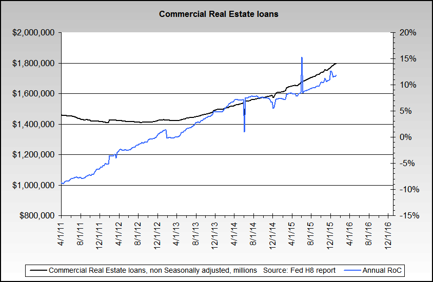
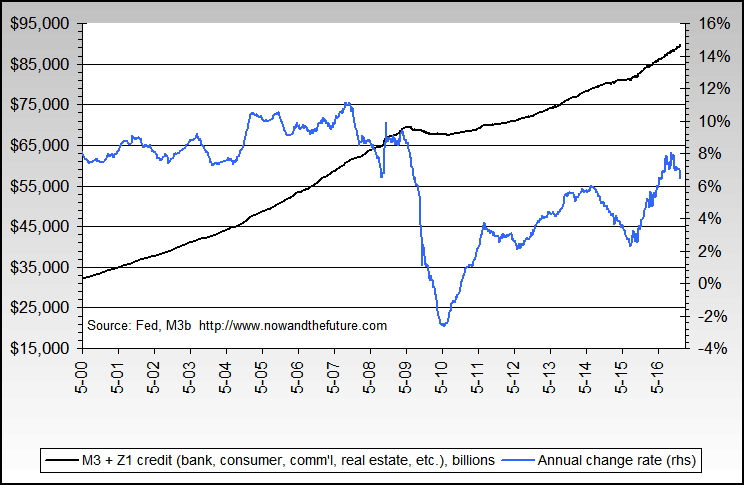
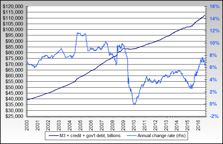
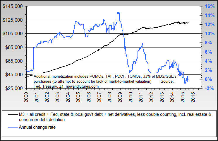
| Total credit, with sectors | Money supply values |
|---|---|
 |
 |
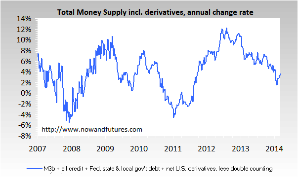
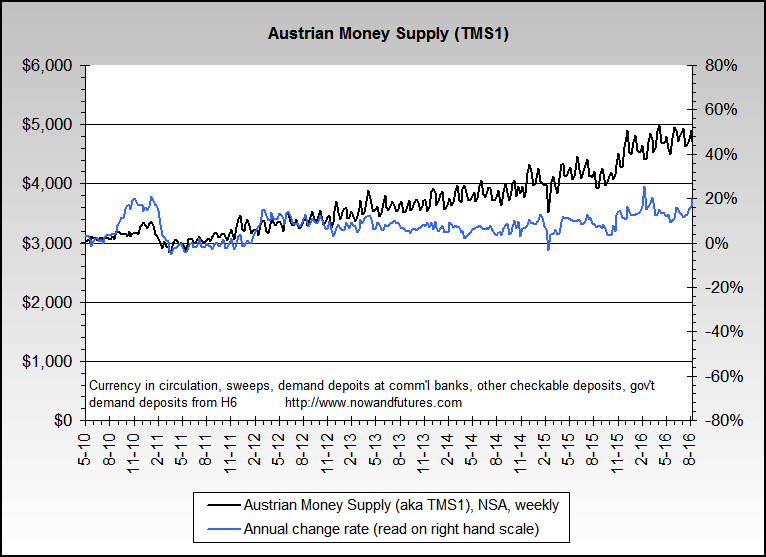
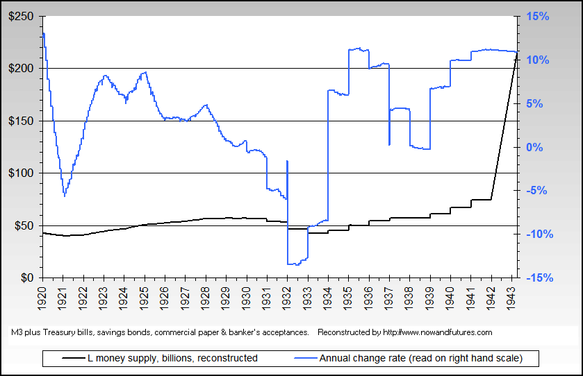
| Total money supply, w/deriv. | Austrian AMS (TMS1) weekly |
|---|---|
 |
 |
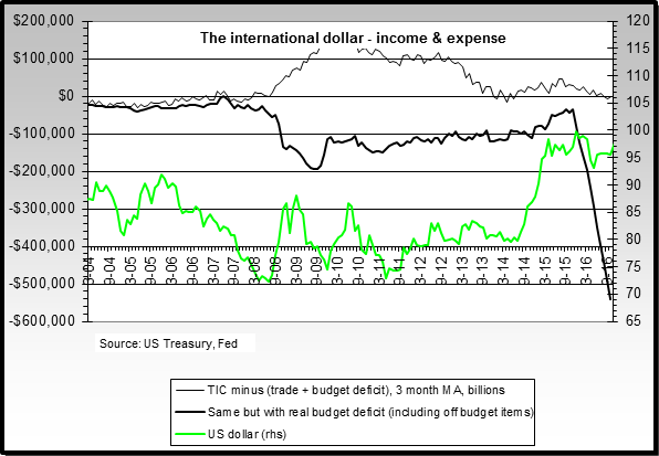
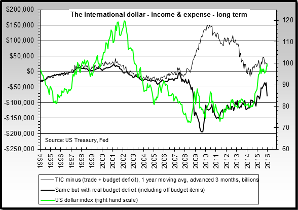
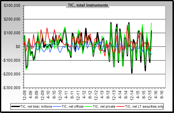

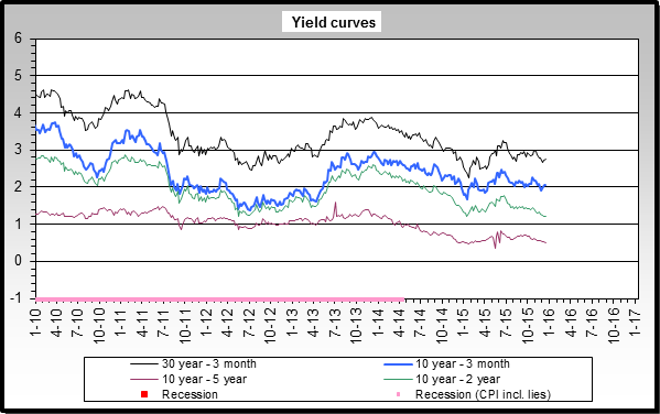
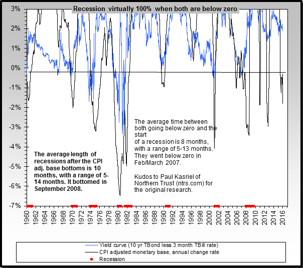
| Recession probability | Yield spread - 10 year & 3 month Treasuries (burgundy line in chart below) |
Recession probability, adjusted ** | ||
|---|---|---|---|---|
| 5% | +1.21 | 30-35% | ||
| 10% | +0.76 | 35-40% | ||
| 15% | +0.46 | 40-45% | ||
| 20% | +0.22 | 45-50% | ||
| 25% | +0.02 | 50-55% | ||
| 30% | -0.17 | 55-60% | ||
| 40% | -0.50 | 65-70% | ||
| 50% | -0.82 | 75-80% | ||
| 60% | -1.13 | 85-90% | ||
| 70% | -1.46 | 95-100% | ||
| 80% | -1.85 | 100% | ||
| 90% | -2.40 | 100% |
